Best Value Copy Blog
  • HOME
  • PRINT TIPS
  • NON-PROFIT
  • EDUCATION
  • GRAPHIC DESIGN

IMAGINE, INSPIRE, VISION 
PRINTING FOR GRAPHIC & CREATIVE DESIGN

Choosing The Right Font

8/5/2016

2 Comments

 
Picture

​Alvin Thomas

Picture
Choosing a font for your message sets the tone for the entire piece. Before you choose a font you should consider your audience and the tone of voice that you will use to reach them. The last thing you want to do when coming up with a new design is create something  that leaves your audience wondering what the actual message was. 

Always be careful not to take away from the overall message of your content. Grabbing your audience’s attention is crucial, but cluttering a design with wild fonts can spell disaster!

Remember, you wouldn’t wear sandals to a marathon, and you wouldn’t cook bacon without a shirt on...unless you were feeling adventurous. What I’m trying to say is that selecting a font speaks volumes, and  in the case of a graphic designer, it speaks volumes for a client, so it’s important to make sure that your design is dressed with an appropriate font.

Consider these 3 questions when determining the right font:

  • What’s the nature of who/what the design is for? (Law Firm, Kids Birthday Party, Live Event) 

  • What’s the overall message that you want to send to your audience?

  • How do you want your design to make your audience feel?

There are 3 basic fonts that we will be going over; they are: Serif, Sans-Serif and Script/Handwriting. Each of these basic font categories will give your audience a certain feel when viewing your content.

Here’s what you should know:

Serif Fonts
Serif fonts are those that have lines stemming from the ending strokes of each letter. Some like to think of these lines as feet that the letters stand on, so it’s no surprise that this sturdy font does well to give off a vibe of seriousness.  Some common serif fonts are Cambria and Times New Roman.

Sans-Serif Fonts
sans is a french word, which literally translates to “without”. So, Sans-Serif means Without-Serifs. This font looks a bit more contemporary in comparison to serif fonts, which have a more timely feel.  Examples of Sans-Serif fonts are Arial and Verdana. 


Script/Handwriting  Fonts
these are the fonts that appear as though they were handwritten. Whether the characters look like they were written with Crayola or a quill,  it’s all Script/Handwriting fonts. Earlier I mentioned something about speaking in volumes. This would be considered pretty loud,  so you don’t want go overboard. It’s best to be choosy with this font.


If you decide to go with more than one font for a design that’s great, just make sure you’re adding value, too many fonts can make things start to look haywire. The contrast between different fonts is a key element in crafting a  spectacular message.

What combination of fonts do you like together?

Tip:
After you come across a combination of fonts that work well together add them to a list with other combinations for later use.

2 Comments

Is Print Design Dead? New Opportunities for Graphic Designers

8/5/2016

0 Comments

 
Picture

​Mark Stokvis

Picture
Its no mystery, Graphic design is changing.   We all know the tidal wave of artists flooding into the budding world of internet connected devices has had a profound impact on the opportunities that present themselves to graphic designers.  As publications move online and big media shifts away from the original information technology, printing, a flood of new designers begin a career in this new landscape and the old dogs quickly shifting into new tricks.


As the talent pool swells with excitement bordering on hysteria, similar to a group of 13 years old girls at a Justin Bieber concert, the opportunities actually dwindle rapidly.  If you're hiring what’s better than a massive talent pool to pick and choose from?  If you’re a job seeker the field is fiercely competitive.  But, there is is a lurking and rapidly forgotten element to the artistic world of graphic design. Printing is alive and well in its new short run, quick turnaround manifestation of the communication arts.

Short Run Printing? Really?

Yes.  Sure the days of long run offset jobs are dwindling now that everyone can easily obtain information on a device that fits in the palm of their hand.  As offset printing declines digital is printing rising.  Why?  Companies still need printing, they just don’t need it in the quantities of the past.  Business beseeches the need for small quantities produced quickly, inexpensively and at high quality to meet the demands of customers who are unwilling to expend effort in learning, searching or sharing personal contact info simply to learn more their company’s products or services.  They need digital short-run printing.

Small businesses especially face unique challenges in the expanding shadow of the Internet.  Imagine, walking into a local store when suddenly you are approached by the owner. He or she starts asking for your email address, phone number or to bump phones.   I’m guessing that most of you are saying...uh...no...I’m not going to do that.  It’s just plain awkward and a lot to ask of anyone.  

Now imagine they approach you but this time with a colorful tri-folded brochure.  The owner says something like “we are having specials next week, come on in and give it a try.  Here is all the information” and then hand you the brochure.  

You’re much more likely to take that physical printed brochure than give the “DNA” sample the owner from the first example wanted. 

 No divulging of contact info that will flood your inbox with emails 3 times a week.   Plus its instant information that requires no more effort than looking down, opening it up and reading what’s inside.

Picture
Opportunity for
​Graphic Designers


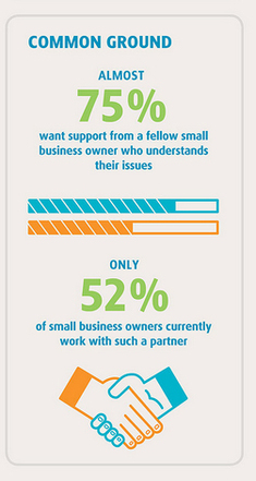
Two words, “market size”.  According to the US Dept. of Commerce, 78.6% of all employer firms in the United States are businesses with 1 to 9 employees. 

If you add in firms up to 99 employees the number rises to 98.2% of all employer firms.  That’s market that still needs print, its a market that still looks you in the eye and shakes your hand. So many of these businesses are desparate need of high quality artistic design that can only be provided by a talented graphic designer.  They know that a great looking print design that competes with the giant box retailer across town is crucial to their survival and the survival of the people that they employ.

The best thing is these are customers that are not difficult to find.  You walk into their stores every day to buy your morning cup-o-joe, grab some lunch midday, get your clothes dry cleaned or fix your car.  They may make a great sandwich or fast oil changes but you can make them the a great take-out menu or a promotional flyer.  

Bring it all back to the beginning of this article and you can see how short-run high quality digital printing coupled with a great design can really be profitable for you, for the small business and can provide the customers they service with the barrierless information they are willing to accept.

Find yourself a great print partner, walk into your favorite store and expand your graphic design opportunities today.


What Small Businesses mean to the Economy

Picture
0 Comments

Focal Focus On Design - Moves Like Avatar

8/5/2016

1 Comment

 
Picture

​Alvin Thomas

Picture
This week’s Focal Focus on Design, is a video that comes from Method Studios, in London. This award winning digital effects group has a way of working with colors that’s nothing short of downright groovy!
​

​Yes, the groove is alive with these one’s, and the groove is most certainly of 

importance to the working professional. Generally speaking, the same goes for anyone who spends hours in a chair all day, so when your profession involves a heavy dose of design, to top that off -- it's not a bad idea to get up and move around a little. Sometimes that takes a bit of encouragement, maybe a smidge of inspiration here and there. Well, if you’ve got eyes, we’ve got answers.

So, take a lesson from these avatars that really know how to move their pixels! Yep, these awesome dancers are modeled after real people, but totally digital. Method Studios used a 
motion capture method to help these pixels twist and shake.

Chances are one of two things happened while watching this video: your eyes lit up or your head started to bob, in either case you’re halfway there. So, do this moved you? ​​
1 Comment

Focal Focus On Design - Color Of The Month

8/5/2016

0 Comments

 
Picture

​Alvin Thomas

Picture
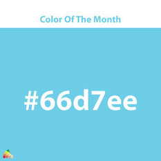
The color of the month for July is,  #66d7ee.

Each month as part of our Focal Focus On Design we’ll be featuring artist from across the web that have a knack for making colors pop! These are a collection of artist with a palette that a has a taste for something a bit -- more bold.
​

Inspiration by colorIt is our hope that this collection will help to you to feel inspired, and to think about maybe using colors a little differently in your next project. Each color of the month will highlight colors that we feel contemporary designers and artist are beginning to drift toward in experimentation.

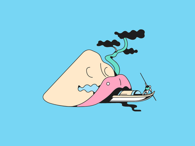
This week our focal focus is on artist,Chuan Jia  (Trajan). The design we focus on today uses an intermingling of flowing shapes, to portray a figure on a fishing boat, in this imagery used for a website icon.

Picture
0 Comments

5 Inspirational Boards for Fall

10/5/2015

0 Comments

 
Picture
Alvin Thomas

Picture
Now that we've got you thinking pumpkin, I mean creatively, we 
have a question for you. What items will you be spicing up this Fall? 
Brochures, Calendars, Flyers, Postcards? Comment below.

(Best Value Copy Pinterest will be up and running soon!)

It’s Happening! 

Leaves are changing colors, Football is on TV 
every Saturday, Sunday and Monday, you’ve already decided it’s officially 
“NorthFace weather”, and everything you eat or drink comes with the option of 
being regular or “pumpkin spiced”. Yes, Fall is upon us, and with it, the start of the Holiday season!

With so many Holidays fast approaching one thing 
is for sure, graphic designers and the whole office will be hard at working 
stretching their creativity to the drop of the ball and after. The real question 
is, how are you contributing to the Holiday think-tank around the office?

Still thinking? That’s okay, we've got just the thing to get those 
creative, pumpkin spiced juices flowing!

Whether you’re printing for a 
party or a presentation, we've selected 5  
festively Fall(try saying that 5 times fast)  Pinterest 
boards that are sure to inspire and give you that extra jolt of creativity you 
need leading into this year’s Holiday season:

Picture
0 Comments

How Much for That Banksy in the Kiosk?

3/10/2015

0 Comments

 
Picture
Alvin Thomas

That couldn’t possibly be – could it?
 Well, it is, or better yet – they are.
Original Banksy prints were not only on display
 this weekend in Central Park, they were for sale!


For those of you who don’t already know, Banksy is a
internationally known graffiti artist, painter, political activist and Academy
Award nominated film director. 

He is best known for his stencil artwork, which can pitch prices 
 upward of six figures, but it seems that no one in Central Park had a clue or
a care. One woman, the first sale of the day, managed to talk down the price
from $60 to half-off! Quite the deal when you consider that Angelina Jolie and
Brad Pitt bought several Banksy pieces for more than £1 million, and just
this summer a single piece was auctioned off at $249,000!
 
Now, a certain number of lucky tourist have the pleasure of
hanging up original Banksy’s in their homes because they “just need something
for the walls” or simply as a gift for their children.

A video of the Banksy art sale in Central Park has been posted
on YouTube. The video portrays a grey haired old man sitting in a chair for
hours before getting a single buyer. At 6pm it was closing time, total sales for
the day, $420. 

​I wouldn’t mind buying a hundred-housand dollar poster for just $60. Then again, I always order from Best Value Copy, making that black and white print only 2.5¢.
0 Comments

Business Card Psych 101

4/23/2014

1 Comment

 
Picture
Alvin Thomas

Business Card Psych 101:

Class is now in session and we're skipping syllabus week! Here's an equation that could take a full semester to figure out the answer to: How can you design the #BEST business card for your business?  

Standing out in a sea of 2x3.5  isn't always so easy. 

Each time that someone looks at your business card  that card is  saying a lot more than what's printed on either side of the paper. Each time, because no one gets handed a business card and touches it just once ...unless you'rePatrick Bateman.

So what's the #BEST way to reach a solid conclusion for this semesters question? 

Hypothesize!
It’s a no-brainer that the quality of printing is essential in the overall success of a business card. What’s more, you’re going to want a decent quantity of cards for those occasions where you're . This makes whoever does the printing of your cards a pretty big to-do. 

Still, there is one thing that’s perhaps even more important than who prints your cards; how they’re designed! Depending on the choices you make, your card will either be an attention-getter or a wallflower.

So what's the answer to this semester's  brain buster? Arranging the components of your card in a way that makes sense psychologically!

When done correctly your business card’s design will become a small piece of semantically sound eye-candy -- just waiting to be swallowed up, whether it’s given out by hand or picked up off the floor.
​
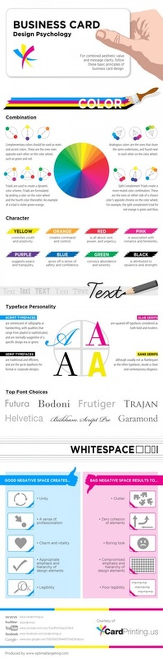
Usually solving a problem of this magnitude would take a full semester, but today you'll be getting a crash course in the psychology of business cards with this study guide!

Picture
1 Comment

5 Cheery & Bright Pinterest Boards

12/16/2013

1 Comment

 
Picture
Alvin Thomas

Picture
The holidays are upon us, and with them-- enough designs filled with snowmen and sleigh bells to make your heart grow three sizes in a day.

A good design can do more than just boost holiday cheer, it can also boost sales! But sadly, coming up with a great holiday design is often easier said than done. It takes time, inspiration and lots of coffee breaks; things that not many of us can find time for while we’re in the midst of trying to spend us much time with family and friends as possible . That’s where Pinterest comes in!

Yep, that's right, we're taking it to Pinterest. Whether you’re searching for inspiration on the perfect design or a holiday template that will leave everyone feeling cheery and bright, chances are there’s a board that has just what you’re looking. 

So, to help you sift through the all the clutter of the holidays we've compiled a list of 5 Pinterest boards to keep spirits bright and inspire that perfect holiday design you've been dreaming of.

1 Comment

    Archives

    August 2016
    October 2015
    March 2015
    April 2014
    December 2013

    Categories

    All

    RSS Feed

Powered by Create your own unique website with customizable templates.
  • HOME
  • PRINT TIPS
  • NON-PROFIT
  • EDUCATION
  • GRAPHIC DESIGN